

Custom Weapon selector and thiner Health Bar HUD for (21.9) and (16.9)
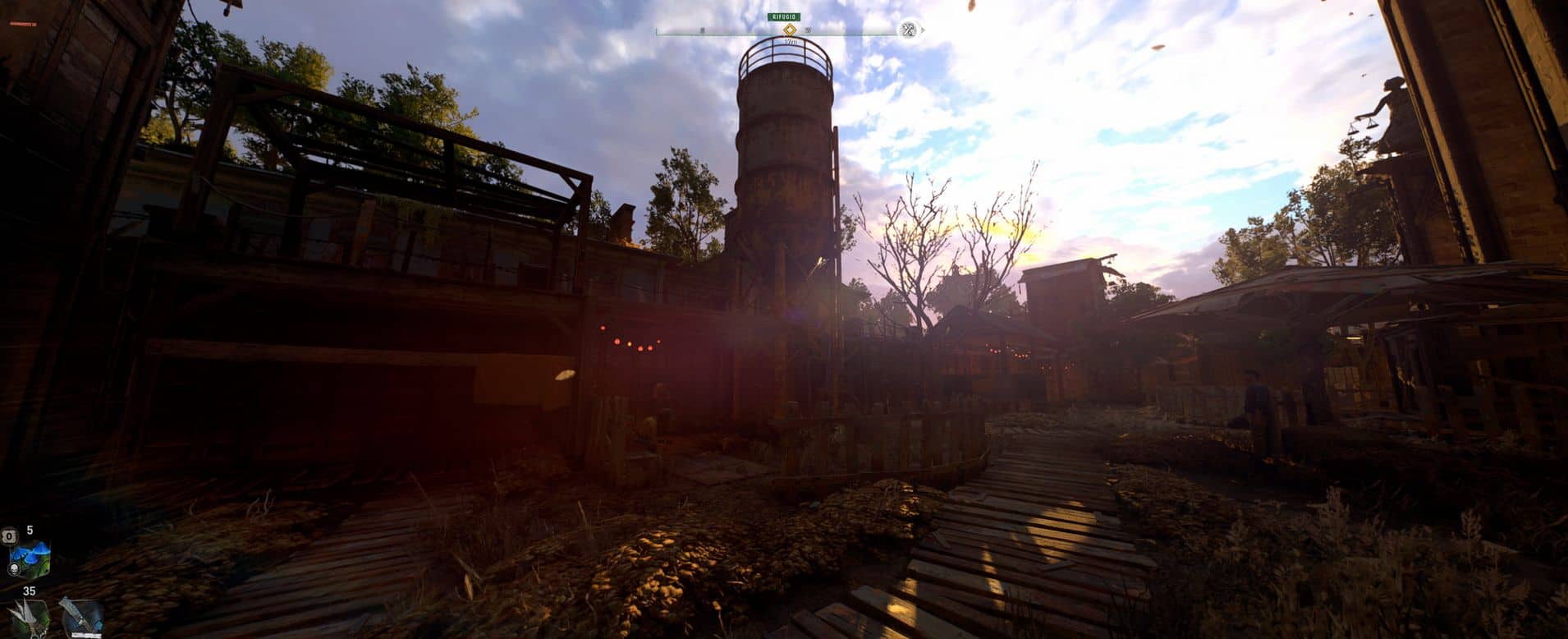
This mod makes the healthbar thiner, and the weapon selector without torch icon to make it less intrusive. With multiple selections.
This is my first mod and I’m very novice, so be patient.
I started making this mod, because sadly the game doesn’t support the 21:9 aspect ratio. I was inspired by his mod Trasparent healthbar.
Since I’m at the beginning of the game the healthbar is short. But I used some advanced save from the community, and the healthbar seems growing correctly.
WHAT’S IT FOR
– The Healthbar is thiner and (for me) placed in a better area for a (21:9 & 16:9) monitor.
– The weapon selector is not showing the torch icon anymore. So, it’s not a cross, but has a new “shape” to adapt better in the monitor corner.
(21:9 & 16:9) + multiple selections (go to the images to see the differences)
(I tested it with 3440×1440 and 2560×1440 monitor resolution. If you have any issue with the position just let me know)
HOW TO INSTALL:
1 – First I recommend to backup “data0.pak” in “SteamLibrary\steamapps\common\Dying Light 2\ph\source\data0.pak (if you prefer, you can
backup just hud_pc)
2 – Just open “Custom HUD for xx.x”, select the file that you want (only one) and put data3.pak in “SteamLibrary\steamapps\common\Dying Light 2\ph\source”
if you have data3.pak rename this to data4.pak or the next available number
3 – If you are using Simple HUD go to my data3.pak and select “new_health_indicator_pc.gui” and “weapon_selector_pc.gui” and move in gui\hud_pc
in Simple HUD dataN.pak.

